
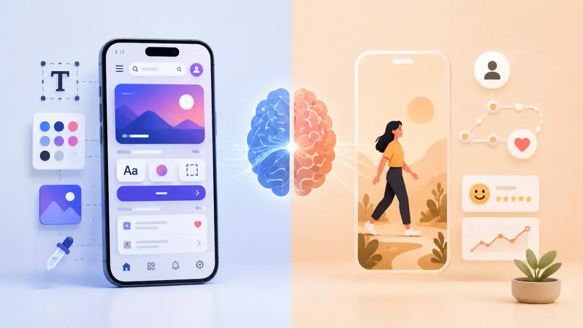
Walk into almost any software team meeting and you'll hear the terms UI and UX tossed around, often in the same breath. Job listings ask for "UI/UX designers," product teams debate "UI/UX improvements" and most people have picked up the rough idea: UI is about how something looks, UX is about how it feels to use. But that surface-level understanding hides a much more important question that developers, in particular, tend to overlook.
Are we actually designing for user experience, or are we just polishing the interface and calling it a day?
It's entirely possible to build an app with gorgeous gradients, smooth animations, and modern typography that people genuinely hate using. Maybe every tap takes a beat too long to register. Maybe the buttons are ambiguous, the error messages are cryptic, and a two-step task somehow takes six screens. A pretty shell around a frustrating experience is still a frustrating experience, and that gap between "looks good" and "works well" is exactly where UX lives.
What UX Actually Means
User Experience, or UX, describes the full experience someone has while interacting with a product, not just what they see on a screen. The Nielsen Norman Group, one of the most cited authorities in the usability field, frames UX as covering every touchpoint a person has with a company and its products, not a single interface.
In practical terms, UX is answering a string of questions: Can someone figure out how the app works without help? Can they find what they're looking for? Does the system respond in a way that makes sense? What happens when they make a mistake, and can they recover from it easily?
Take a basic online checkout. The user's experience doesn't start when they click "Buy Now," it starts the moment they land on the site. Finding the product, understanding its details, picking options, reviewing the cart, entering payment info, and getting a confirmation are all part of one continuous journey. UX isn't a screen. It's the whole path from start to finish.
UI and UX Aren't Interchangeable
These two terms get used almost as synonyms, but they describe genuinely different things. UI, or User Interface, covers the visual and interactive layer: colors, typography, buttons, icons, spacing, and layout. UX is the broader experience surrounding all of that.
A helpful comparison is a restaurant. The UI is the interior design, the lighting, the furniture, the menu's visual layout. The UX is the entire dining experience: can customers find the place, understand the menu, order without confusion, avoid a long wait, and pay without hassle? A restaurant can have stunning décor and still deliver a miserable dining experience. Software works exactly the same way.
Why UI Tends to Get More Attention
There's a simple reason interface design dominates the conversation: it's immediately visible. The second someone opens an app, colors and layout create an instant impression. Good UX, by contrast, tends to disappear when it's working. Nobody praises "excellent information architecture" out loud, they just say "this app is really easy to use," without realizing dozens of small UX decisions made that possible.
That doesn't mean interface design should be dismissed. A strong UI is still part of a successful product, it's just meant to support the broader experience rather than become the entire goal.
Why Developers Need to Care About UX
There's a common assumption that UX belongs entirely to designers, and that a developer's job stops at implementation. In reality, technical decisions shape user experience just as much as visual ones do.
Google treats page performance as a genuine part of user experience rather than a separate engineering concern. Its Core Web Vitals program measures things like loading speed, visual stability, and interaction responsiveness, and it's had real teeth behind it since 2021, when these metrics became part of Google's search ranking signals. The program has also kept evolving: on March 12, 2024, Google officially retired First Input Delay in favor of a newer metric called Interaction to Next Paint (INP), which tracks the responsiveness of every interaction on a page rather than just the first click, with anything under 200 milliseconds considered a "good" score. That shift alone reflects how central responsiveness has become to how UX gets measured on the modern web.
Performance Is a UX Problem, Not Just a Technical One
Picture clicking "Submit" and having nothing visibly happen for several seconds. You click again. Then again. Eventually you wonder if it worked at all. That's not really a backend issue in the user's eyes, it's a UX failure because the app never told them what was happening.
Developers can close that gap through faster API responses, efficient database queries, image optimization, caching, and, critically, visible feedback like loading indicators. None of that is purely a technical concern. It's the user's experience, built out of code.
Error Messages Are UX Too
Few things damage trust in an app faster than a message like "Error 500: Internal Server Error." It's technically accurate and completely unhelpful. Something like "We couldn't submit your form. Please try again" gives the person a clear next step instead of a dead end.
Good UX isn't about eliminating errors, they're an unavoidable part of any system. It's about making sure users understand what happened and how to recover from it without frustration.
Small Loading States Make a Big Difference
Uploading a document that takes several seconds without any visual change makes people wonder if the button even worked. A simple "Uploading..." followed by "Upload complete" solves that instantly. Nielsen Norman Group has long identified "visibility of system status" as one of its foundational usability heuristics, because knowing what the system is doing helps people feel in control rather than stuck guessing.
Accessibility Belongs in the UX Conversation
An app that only works for users who interact with it exactly the way the development team expects is an app that excludes people. Visual, hearing, motor, and cognitive differences all shape how someone uses software, and developers have real influence here: can the app be navigated by keyboard alone? Do buttons have meaningful labels? Is text contrast sufficient for low-vision users?
The W3C's Web Content Accessibility Guidelines, commonly known as WCAG, exist precisely to answer these questions with concrete standards. The current version, WCAG 2.2, became an official W3C Recommendation on October 5, 2023, received a minor editorial update on December 12, 2024, and was formally adopted as the international standard ISO/IEC 40500:2025 on October 21, 2025. It's now the benchmark referenced in accessibility law and litigation across much of the world, which makes it far more than a checkbox, it's a core part of what "good UX" means in 2026.
What Actually Distinguishes Good UX
There's no single formula, but a few traits consistently show up in products people describe as easy to use:
- Usability — users complete tasks without unnecessary friction, and a simple action shouldn't require ten confusing steps.
- Simplicity — fewer, well-executed features usually beat a sprawling feature list nobody fully understands.
- Consistency — a blue button that means "Continue" on one screen shouldn't suddenly mean "Delete" on another.
- Feedback — actions should be acknowledged, "Saving..." followed by "Saved successfully" builds confidence that the system understood the user.
- Predictability — users should be able to form accurate expectations about how the app will behave.
- Responsiveness — the system doesn't need to be instant, but it does need to communicate its state clearly at every step.
A Quick Example: Two Ways to Handle a Failed Login
A poor experience shows "Authentication failed" and leaves the user guessing whether it was the password, the username, or something else entirely. A better experience says "Incorrect password. Please try again or reset your password," which tells the user exactly what happened and what to do next. The same logic applies to something as small as where the "Forgot Password" link sits, buried and hard to find versus clearly placed near the password field. Neither fix requires fancy animation, just a clearer read on what the user needs in that moment.
UX Extends Beyond the Screen
Consider a video calling app. Its interface might look sleek, but the actual experience is shaped by things happening around the interface: an unstable connection, a denied camera permission, a dropped call, sudden silence on the line. A good app communicates these states plainly, "Connecting...", "Your microphone is unavailable. Please check your permissions.", "The connection is unstable." These aren't polish, they're core UX, and they're deeply tied to how well the underlying system is built.
Developers and Designers Are on the Same Team
UX isn't a tug-of-war between developers and designers, it's a shared responsibility. A designer focuses on research, information architecture, and interaction design; a developer focuses on performance, APIs, architecture, and technical constraints. When a designer proposes a complex animation and a developer flags a performance cost on lower-end devices, the productive move isn't rejecting the idea outright, it's finding an alternative that preserves the intended experience without introducing new problems. Good UX comes out of that back-and-forth, not from either side working in isolation.
Common Mistakes Developers Should Watch For
A few habits quietly undermine UX even in apps that technically work fine: piling on features that add complexity without real value, exposing technical language like HTTP status codes to end users, writing error messages that don't explain what to do next, assuming users understand the system as well as the people who built it, and designing primarily for desktop while treating mobile as an afterthought.
Test UX, Don't Assume It
One of the most common traps is thinking, "If I understand how to use it, everyone will." You've spent weeks or months inside the system, the user hasn't. Real usability testing, handing someone a task like "create an account and find your previous orders" and simply watching where they hesitate, click, or get confused, reveals problems that are invisible to the people who built the thing. It's an established practice for a reason: it surfaces what assumptions alone can't.
Conclusion
UI is what users notice first, but UX is what they carry with them after they close the app. A striking interface can earn a strong first impression, yet visual polish alone can't rescue a product if people struggle to navigate it, decode its errors, or accomplish what they came to do. For developers, taking UX seriously means recognizing that every API response, loading state, error message, and accessibility decision shapes how the app actually feels to use. The right question isn't just "does it work?" It's "can people use this easily, and what are they experiencing while they try?"
Sources - Nielsen Norman Group, W3C Web Accessibility Initiative — WCAG 2.2, W3C — WCAG 2.2 Recommendation Announcement, Google Search Central — Introducing INP, web.dev — INP Becomes a Core Web Vital